Storybook
UI 컴포넌트 개발 도구이다
- 작업 효율 증가
- 원활한 소통
- UI 변경 확인
- 디자인 시스템 활용
스토리북 설치
npx storybook@latest init
스토리북 열기
npm run storybook
6006번 포트로 연결되어서 프로젝트에 영향을 주지 않고 사이트를 열 수 있다.
.storybook 디렉토리는 스토리북의 전체적인 설정 관리
stories 디렉토리는 실제 스토리 파일을 작성
→ <컴포넌트명>.stories.js 에 작성한 것들이 스토리북 웹사이트에 반영.
실습
import "./customButton.css";
import PropTypes from "prop-types";

export const CustomButton = ({
  size,
  label,
  variant,
  backgroundColor,
  color,
}) => {
  const style = {
    backgroundColor,
    color,
  };
  return (
    <button
      className={[
        "custom-button",
        `custom-button--${size}`,
        `custom-button--${variant}`,
      ].join(" ")}
      style={style}
    >
      {label}
    </button>
  );
};

CustomButton.propTypes = {
  size: PropTypes.oneOf(["sm", "md", "lg"]),
  backgroundColor: PropTypes.string,
  color: PropTypes.string,
  label: PropTypes.string.isRequired,
};

CustomButton.defaultProps = {
  backgroundColor: null,
  color: null,
  size: "md",
  variant: "outline",
};
5개의 props를 받고 props에 따라 다른 css 를 보여준다.
CustomButton.propTypes = {
  size: PropTypes.oneOf(["sm", "md", "lg"]),
  backgroundColor: PropTypes.string,
  color: PropTypes.string,
  label: PropTypes.string.isRequired,
};
prop 타입을 지정한다. 해당 부분 설정읕 통해 스토리북 웹사이트에서 그에 맞는 입력값 변경
.custom-button {
  font-family: "Nunito Sans", "Helvetica Neue", Helvetica, Arial, sans-serif;
  font-weight: 700;
  border: 0;
  border-radius: 3em;
  cursor: pointer;
  display: inline-block;
  line-height: 1;
}

.custom-button--outline {
  background-color: white;
  border: 1px solid black;
}

.custom-button--solid {
  background-color: black;
  border: none;
  color: white;
}

.custom-button--sm {
  font-size: 12px;
  padding: 10px 16px;
}

.custom-button--md {
  font-size: 14px;
  padding: 11px 20px;
}

.custom-button--lg {
  font-size: 16px;
  padding: 12px 24px;
}
className이 변경될 때마다 유동적으로 css 변동
Story 만들기
stories 디렉토리에 stories.js 파일 생성
import { CustomButton } from "../components/CustomButton";

export default {
  title: "Test/CustomButton",
  component: CustomButton,
};

export const Solid = {};

export const Outline = {};

export const Small = {};

export const Medium = {};

export const Large = {};
컴포넌트 import 후 다시 한번 export 한다.
// 생략

export const Solid = {
  args: {
    variant: "solid",
    label: "Button",
  },
};

export const Outline = {
  args: {
    variant: "outline",
    label: "Button",
  },
};

export const Small = {
  args: {
    size: "sm",
    label: "Button",
  },
};

export const Medium = {
  args: {
    size: "md",
    label: "Button",
  },
};

export const Large = {
  args: {
    size: "lg",
    label: "Button",
  },
};
arguments 들을 다르게 설정한다.
import { CustomButton } from "../components/CustomButton";

export default {
  title: "Test/CustomButton",
  component: CustomButton,
    // 여기에 args 및 label 추가
  args: {
    label: "Button",
  },
};

// 스토리에 있는 label 속성 모두 제거
export const Solid = {
  args: {
    variant: "solid",
  },
};

export const Outline = {
  args: {
    variant: "outline",
  },
};

export const Small = {
  args: {
    size: "sm",
  },
};

export const Medium = {
  args: {
    size: "md",
  },
};

export const Large = {
  args: {
    size: "lg",
  },
};
공통된 속성을 export 영역에서 args 로 추가해주어 반복을 제거한다.
툴바 조정하기
args: 스토리북의 모양을 조절
parameters: 주변 배경 및 환경 제어
export const Solid = {
  args: {
    variant: "solid",
  },
  parameters: {
    backgrounds: {
      values: [
        {
          name: "blue",
          value: "blue",
        },
        {
          name: "red",
          value: "red",
        },
      ],
    },
  },
};
마찬가지로 export 부분에서 전체 적용이 가능하다.
다른 모든 컴포넌트에서도 적용하고 싶다면 .storybook 디렉토리의 preview.js 를 설정한다.
// .storybook/preview.js
/** @type { import('@storybook/react').Preview } */
const preview = {
  parameters: {
    actions: { argTypesRegex: "^on[A-Z].*" },
    controls: {
      matchers: {
        color: /(background|color)$/i,
        date: /Date$/,
      },
    },
    // parameters 내 추가
    backgrounds: {
      values: [
        {
          name: "blue",
          value: "blue",
        },
        {
          name: "red",
          value: "red",
        },
      ],
    },
  },
};

export default preview;
컴포넌트 동작 테스트
테스트 패키지 설치
npm install @storybook/testing-library @storybook/jest @storybook/addon-interactions --save-dev
(생략)
import { within, userEvent } from "@storybook/testing-library";

(생략)

export const ClickTestButton = {
  args: {
    variant: "outline",
    label: "Click!",
  },
  play: async ({ canvasElement }) => {
    const canvas = within(canvasElement);
    const primaryButton = await canvas.getByRole("button", {
      name: /Click/i,
    });
    await userEvent.click(primaryButton);
  },
};
테스트를 위한 코드 작성
within 메소드의 파라미터 canvasElement 는 컴포넌트가 렌더링되는 canvas 의미. canvasElement 를 루트 요소로 할당
getByRole 부분에서 canvas로부터 button 을 가져온다. 버튼 이름이 Click 이라는 문자열을 포함한 버튼을 가져옴.
userEvent.click 은 사용자가 버튼을 클릭하는 동작을 의미한다.
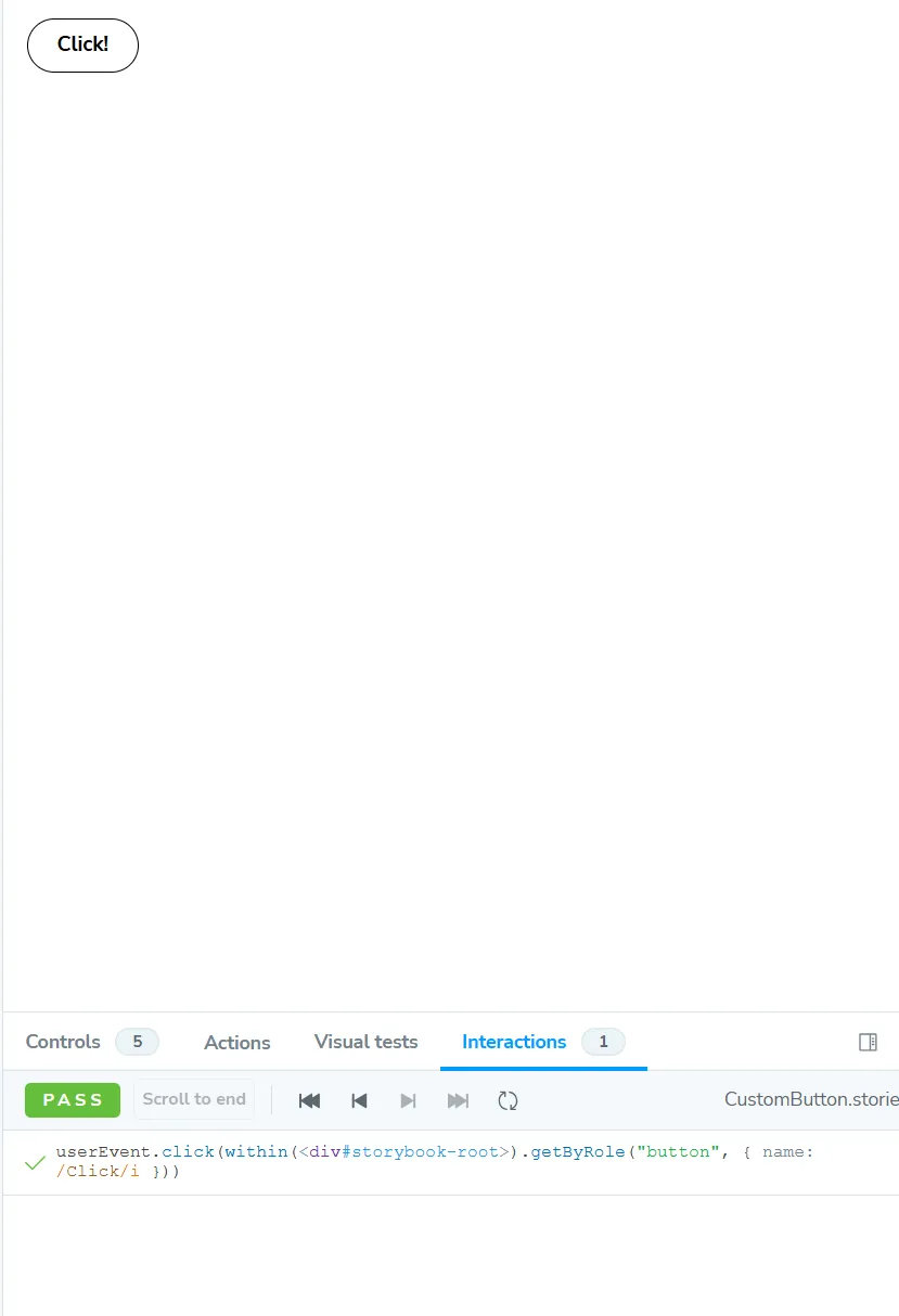
interactions 를 통해 동작을 확인할 수 있다.